
When a company focuses solely on compatibility and marketing strategy this happens. Android 12 downright squander space that I wonder who their targeted audience is. With the screen size getting bigger and bigger the technology giant decides to make a fool of themselves. To add text label for icons which users are familiar with for over a decade, that’s some genius. The look and feel of this OS is terrible. I am not that tech savvy and had no idea about android 12 beta, one day saw the notification to upgrade to android 12 and did. Now that is the biggest mistake ever.
This one is actually grandpa mode!! It looks and feels like a design for young children or elderly.(for larger accessibility) It is overly bulky, too much use of empty space!, terrible notification drop-down and shortcuts. They say it is more personalised but for whom though. The new network connection quick settings is another marvel, what took a single tap now demands more. With one swipe the quick settings of android 11 can be dismissed and it takes two, wonderful.
The icon and text size just won’t come right, its like magnetic poles. The search and settings list text size is another grandpa version. When technology advances people are exposed to more data not the other way around, by removing all these information they take us back a decade. Earlier we were looking forward to the changes and all these upgrades now we should be more vigilant 😓
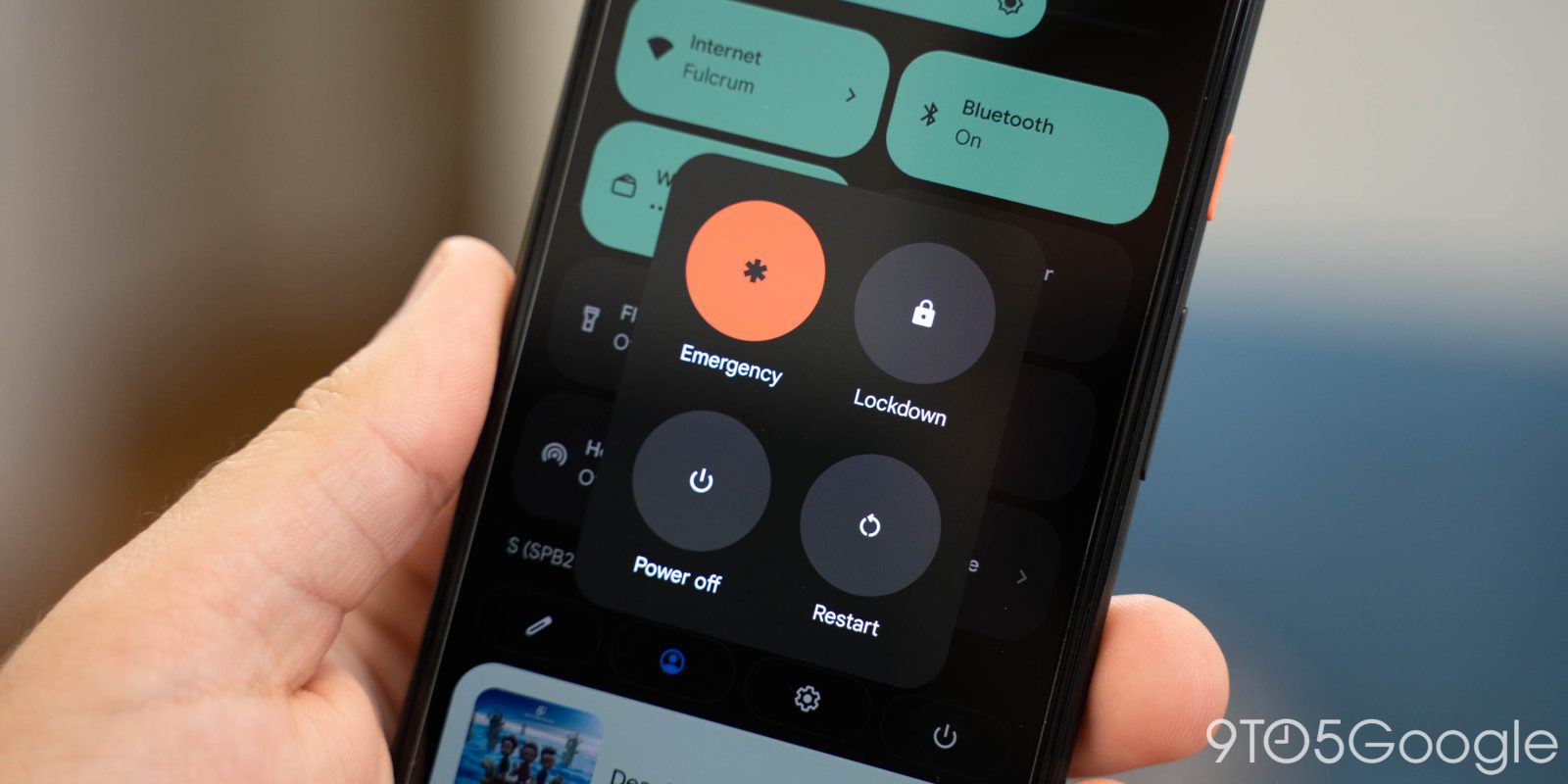
| Power button settings comparison | |
|---|---|
 |
 |
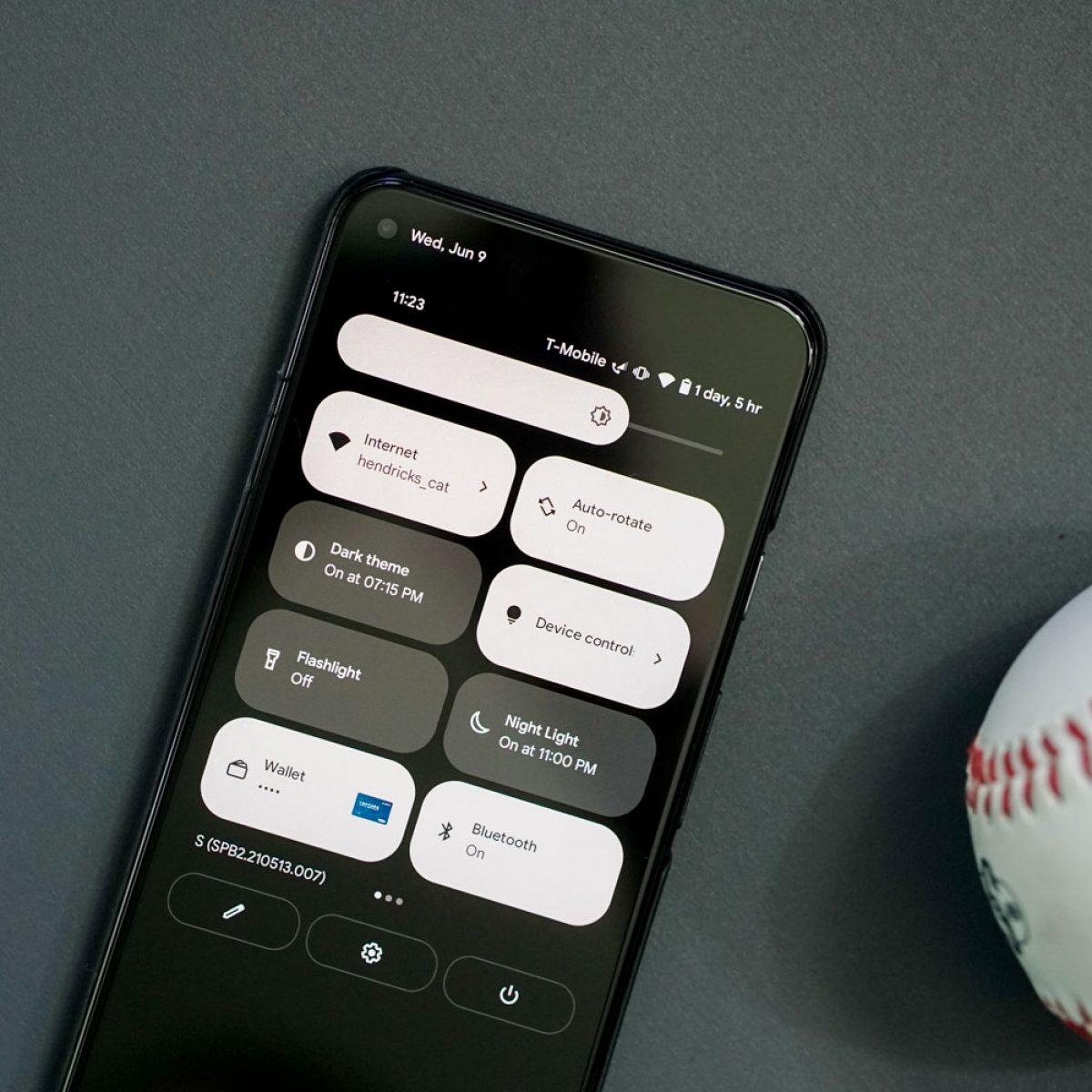
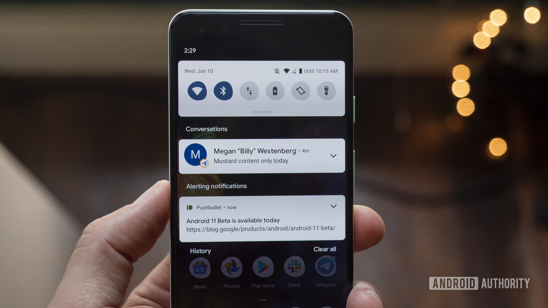
| Quick settings comparison | |
|---|---|
 |
 |